UX case-study: Design meets Metalworking
Everyone has to start somewhere, right? Here is my starting point as a UX designer.

When I first saw “design” and “metalworking” in the same sentence, I knew I was about to work on something meant sharing.
Let me give you a bit of a background. Steiger is a Romanian family business involved in the metalworking industry. They have quite an impressive history which reaches back to the 40s when they were one of the most important boiler manufacturers of that time. Today, the company’s portfolio includes some of the area’s most significant civil and industrial constructions, while also seeing a noteworthy increase in its export sales.
Due to the continuous expansion during the last decade, the need to optimize their process became a priority. Steiger was relying on multiple software and spreadsheets to track their work, which they soon came to realize was ineffective and prone to errors. That was when C4Studio stepped in to help.
Fast forward to the following months and the brief was prepared with the processes and functionalities that needed to be considered. But there were still some questions floating around about the users and their current routines:
- Who are the users? Will factory workers also use the application or is it dedicated only for office workers?
- Do future users of the application have enough computer-skills to do their tasks using the application?
- When and how does each of them interact with the information?
- Who are the stakeholders?
- Are there any restrains we need to address (the solution being one intended for the metal industry)?
- How can we make sure that the transition to the new system will be “painless”?
…to point out just a few of the questions that arose as we had our first “user-oriented” discussion.
Design process
The first thing that we did was to come up with a feasible plan to integrate UX into the already budgeted project plan. It wasn't easy but in the end C4Studio convinced the stakeholders that it was worth investing from the beginning in order to avoid the much higher costs of bad design that might appear later on.
My plan was to use elements and techniques of Design Thinking in order to get more insights about users and thus provide a solution-based approach to the project.
I started off with the five stages of the Design Thinking and figured out ways to integrate each stage in the process that was already ongoing.
Emphatise
I took a closer look at the brief to learn more about the company and their internal process. It was my time to get up-to-date with everything the team had already known about this project. Well, almost everything…
After we leveled the play field, we set down with the development team and started to share the “stories” we observed throughout our research. The team was made up of people with different backgrounds, strengths and viewpoints towards the project so we were able to get some really interesting and diverse insights. We grouped these insights into three categories: Things we know, Things we don’t know and Things we assume.
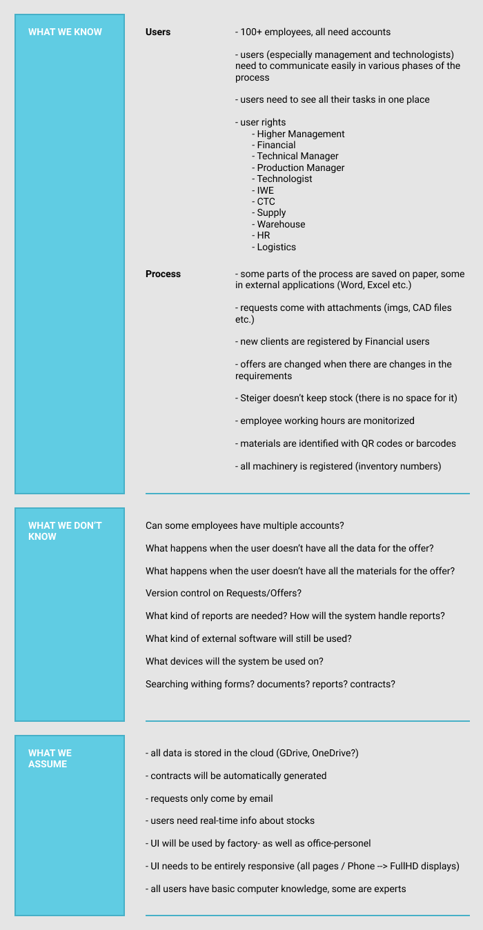
It was time to clarify our questions and challenge our assumptions… So we scheduled a meeting with Steiger’s Technical Manager. In this meeting we found out a lot more about Steiger’s process and the way employees contributes to the end-result.
The key insight was that the entire ERP should be considered as a solution built around the main process. A process which looks something like this:
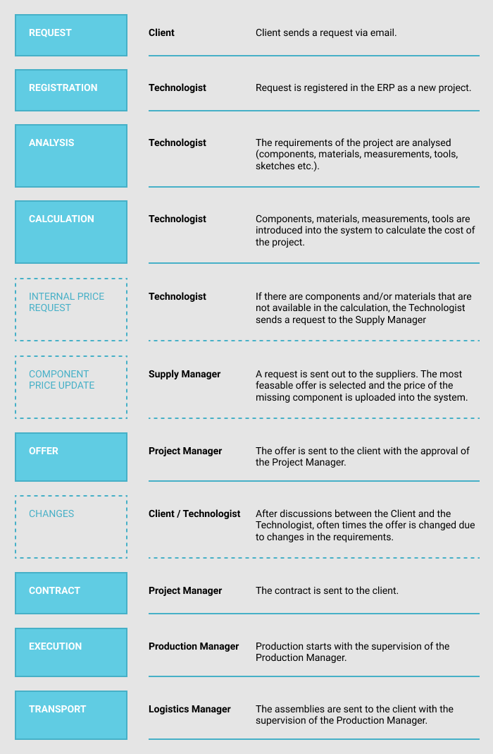
It was time to Define the Problem.
Define
Throughout my career as a designer I learned that it’s ever so easy to get off the rails and invest in seemingly attractive improvements and see the product used “in the wrong way” afterwards. To avoid this, we needed to define a clear problem that this project was set up to solve.
In getting to a problem statement we used the “Point of View” method. The result was the following statement:
Steiger employees need help in improving their workflow because they want to avoid time-consuming and frustrating errors and they want to be more efficient at their work.
In the following months we used this problem statement as our guide throughout the entire project. This helped us in the times when hard decisions and compromises were needed to be taken.
Ideate
One can’t argue that there are many solutions out there which are very efficient in solving the business needs they are meant to solve. Steiger’s ERP is meant to solve many of these business needs, so it seemed natural to use the Cheatstorm ideation method. What I did was to look for existing pools of ideas from other solutions and leveraged them as input for the materials we needed.
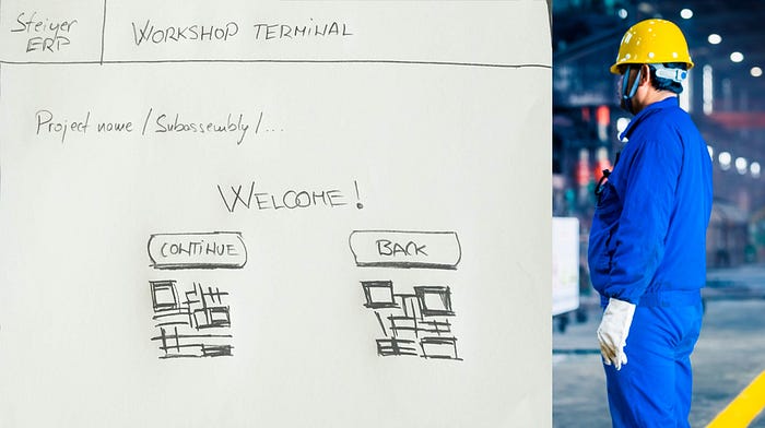
Ideation brought several challenges, one of which was to make parts of the system easy to interact with for the factory workers who very often were wearing gloves. Keyboards or even industrial touch screen displays were not an option because it is difficult to operate them with gloves. To top it off, we also had to deal with the fact that the surface, with which the workers will be interacting, will become greasy. This meant that we couldn't put important information (such as labels) directly on the object with which the worker would interact with. With all these “restrictions” we opted for the QR codes and scanners. The scanners were operated by hand (with or without gloves) and they didn't mind the dirt.
Prototype
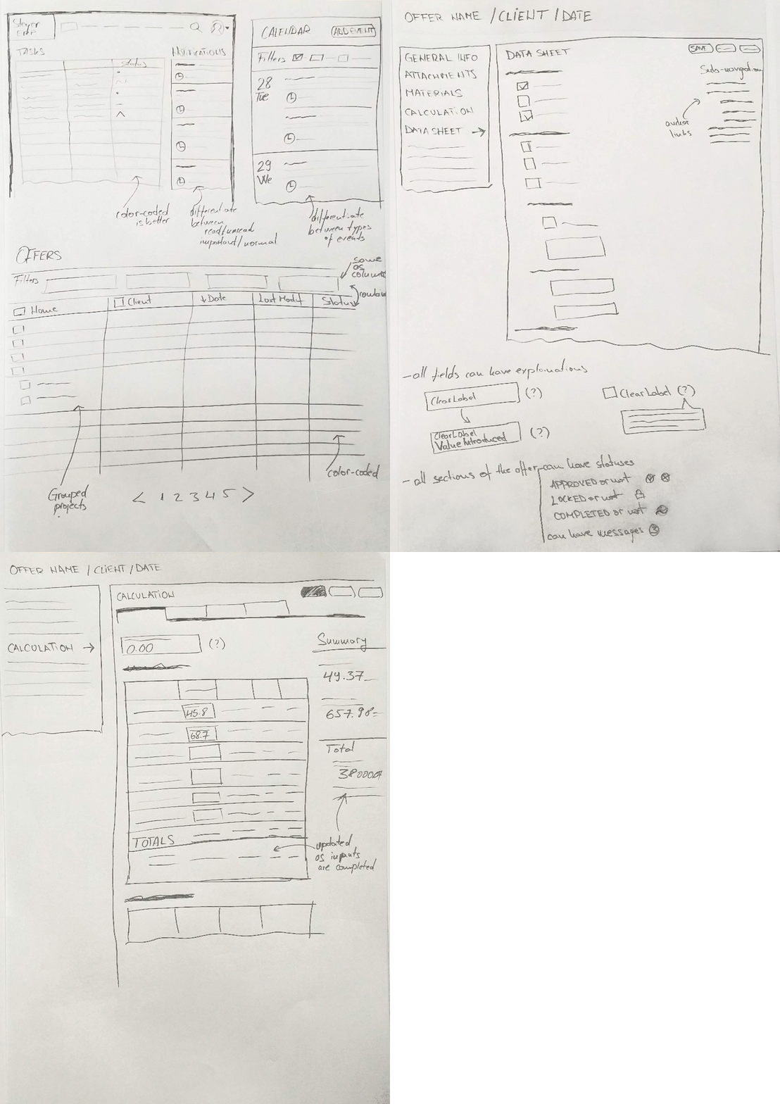
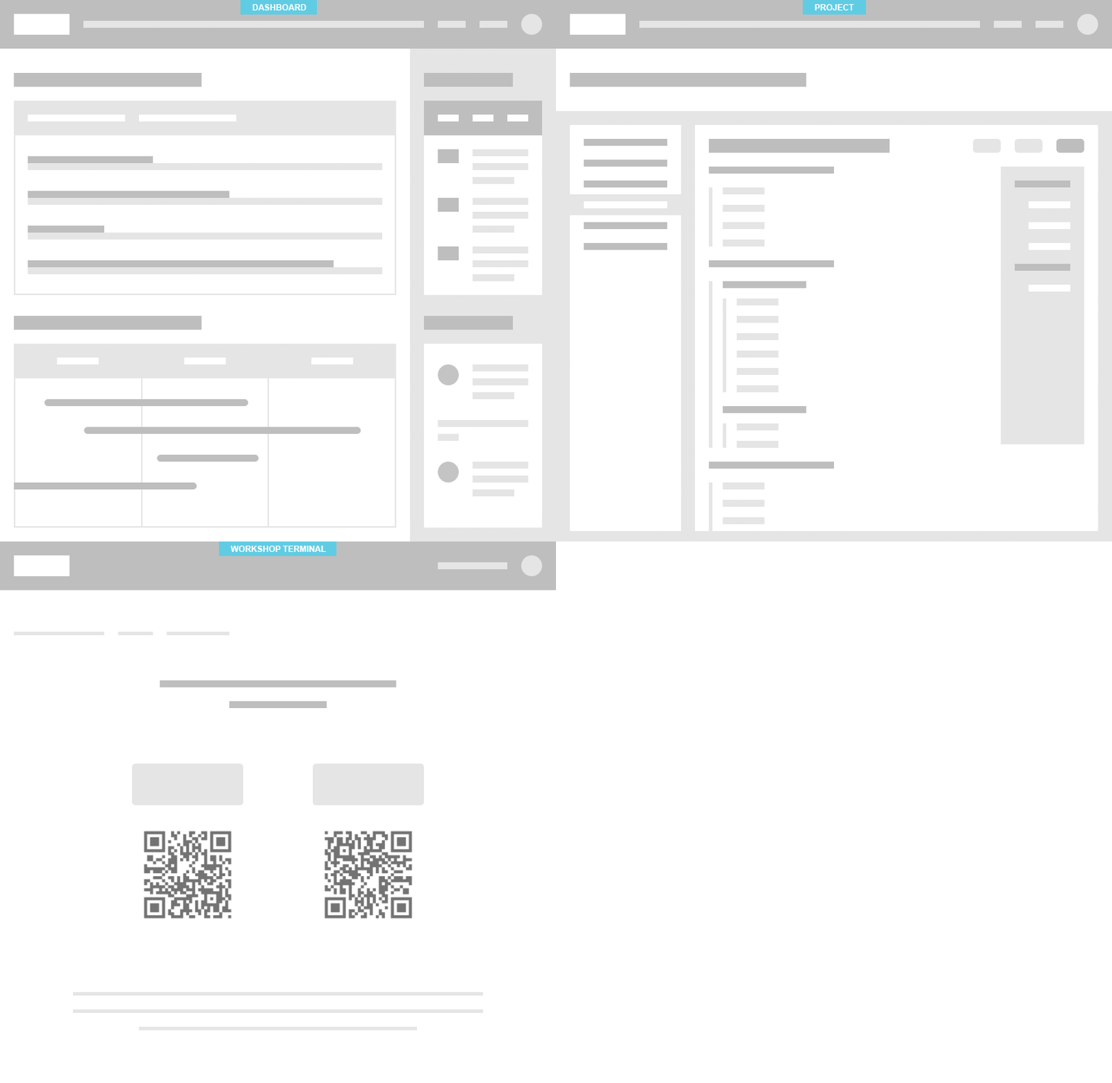
I took my sketches and moved over to Figma to generate low fidelity wireframe mockups for the key pages. Extra work went into making all the elements on the page flexible, in order to maintain an interface which is comfortably accessible on all devices from smartphones to large displays. You can see below the mockups for the dashboard, project page and the workshop terminal access screen.
With the wireframes in place, I started working on the visual design of the ERP. First, I chose the main colors. Then, I created a less detailed version of the logo which I was planning to use in the header.

Until this point, my colleagues were working on information architecture. We wanted to make sure that the framework that we were building is be able to hold the entire content that needs to appear. The content was represented mainly by forms in which users with different rights and ownership were meant to add data throughout the life-cycle of a project. The information was structured into pages grouped together into sections, representing different stages of the project.
Seemed like we had everything we needed to get working on the hi-def prototypes. With the sitemap in front of me, I constructed the header with the main navigation:
- Dashboard / Home link
- Other important links related to projects, providers and customers
- Settings
- Account information and settings
- Messaging
- Notifications
- Search


Note: On small displays, the main navigation menu was accessed by pressing the hamburger icon. This opened a drawer where all menu items are listed.
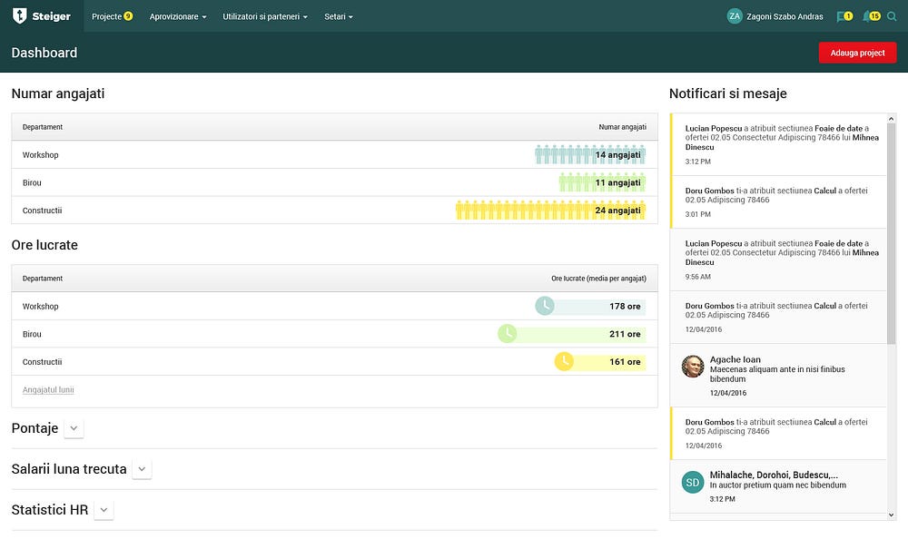
Once the header was in place, I started designing the dashboard. Each type of user had different rights and different areas of work and interest within the company so different sets of panels needed to appear on each dashboard. Together with the team, we created a list of all panel types and I designed all the panels individually. Once all panels were done, we created the individual dashboards for each type of user. Below, you can see the dashboard for the HR user, which was one of the most complex pages.

The page below explores what the Offers page would look like. Based on the information that I got from the technologists, the Date filters were used in a slightly different way that one would expect. All this because, most of the time, the user doesn't know exactly the offer’s creation date. So I took this into consideration when designing the date-picker.

We expected the Offer page to give us most of the headaches. The materials related to this page indicated that the page had many fields and functionalities, making it impossible for the user to find what he needed without some sort of guidance.
Users were familiar with the stages of creating the offer, so we decided to leverage that and to group the fields according to their relevance during each stage of the process.

Note: Each stage had the option to be locked, approved or dismissed by the project owner. The icons on the left show the current status of the stage. Some stages also have numbers displayed to the right to show that there are messages regarding those stages.
Grouping the fields into stages made the pages shorter and the process of completing the fields less difficult. However, there was one particular stage in the process which we still expected users to have difficulties going trough: it was the Calculation stage. This form was complex and it required real-time calculations to be made in the background as the technician was completing the fields. We talked to a few technicians and luckily they already had a “hack” for making calculations easier. They often divided the task into 4 subtasks:
- materials,
- working hours for creating the parts,
- working hours for mounting the parts together
- adding them all up
We created tabs using this exact structure and the page started to look a lot less daunting.
The fact that some parts of the content were not displayed, meant that the users had to switch often between the tabs. To avoid this we allocated space on the display for showing the result of the calculation independently from the tab the user was on.

Test
Once the most important pages were designed, I uploaded them to InVision and created a prototype. Then, we ran a couple of tests with “real users” (technologists and project managers) to see how they would behave, think, and feel when interacting with the ERP. This gave me some precious insights and quite a few ideas for improvement:
- Users did not know where to look for their project. In their mind, Offers and Production were not separated items.
- Users found it difficult to add a new project.
- Users didn't always find the buttons to save their work.
- The Dashboard felt a bit heavy on copy (text) and overall content.
This was a qualitative test and we analyzed each interview separately. As a result, we went back and re-though some of the work we did in the previous phases. Below, you can see a screenshot taken after these adjustments.
Conclusion
The Steiger ERP was the first project in my career as a designer in which there was a dedicated budget for UX. It was interesting to see how Design Thinking can help a business that has so little to do with design (at least, in the traditional sense).
Next steps
We are now in a phase when the ERP is launched and we are analyzing the way workers are using the project features. We hope that, with the use of heatmaps and user-discussions, we will further improve the workflow for Steiger’s employees.
Thanks for reading my first article on Medium! If you enjoyed this case study or have any feedback, I’d love to hear from you.
If you want to collaborate, talk about product design, or just want to say hello, hit me up at zsoltik@gmail.com or connect via LinkedIn.
